

Welcome to the third module in our Machine Learning series. So far we’ve covered Linear Regression and Logistic Regression. Just to recap, Linear Regression is the simplest implementation of continuous prediction (i.e. regression) and Logistic Regression is a version of regression that uses a softmax function to do classification. Now let’s get into something a little more complex – Principal Component Analysis (PCA) in Python.
In this post we will cover:
- What is PCA?
- Dimensionality Reduction with Principal Component Analysis using SKLearn
- Python PCA on Randomized Data
- Creating Our Randomized Sample Dataset for PCA in Python
- Using Explained Variance to Pick the Number of Components for PCA
- Image Compression with Python PCA via SKLearn
- SKLearn PCA Transform in Python for Image Compression
What is PCA?
PCA is a dimensionality reduction technique. The most common applications of PCA are at the start of a project that we want to use machine learning on for data cleaning and as a data compression technique. In the machine learning field, it’s common for datasets to come with 10s, 100s, or even 1000s of features. ML Models use features as independent variables for classification. It’s hard to know which features to play around with when you’re looking at 10 features, much less 100 or 1000.
This is where PCA comes into play. When we run PCA on a dataset, we’ll get a set of features that is a linear combination of the existing features and data on how much of the original variation in the data is kept. That’s all we have to know from a conceptual standpoint for this module, but if you’re interested in learning more, there will be future modules on what actually happens in PCA. For now, feel free to take a look at Singular Value Decomposition – this is how PCA is implemented under the hood. In this article we’re going to go over dimensionality reduction and image compression with PCA.
Dimensionality Reduction with Principal Component Analysis using SKLearn
Let’s start by diving into dimensionality reduction with PCA. Dimensionality reduction is important to machine learning because of “the curse of dimensionality”. The curse of dimensionality basically just says that the more dimensions/features/columns/x values (whatever you want to call it, these are the features we predict with, not the features we predict) we have, the faster the computational processing power required grows. The rate of growth is exponential so it’s important to not have too many dimensions. The first thing that we’re going to do to get started with a dimensionality reduction example is install sklearn, the most popular machine learning library for Python, numpy for handling numerical analysis in Python, and matplotlib for plotting our data:
pip install sklearn numpy matplotlibFor this example, we’ll generate a four-dimensional dataset with 500 samples and use PCA to reduce that to two dimensions. We’ll start by importing the libraries we need, numpy as np by convention, matplotlib.pyplot as plt by convention, and PCA from sklearn.decomposition.
import numpy as np
import matplotlib.pyplot as plt
from sklearn.decomposition import PCA
Python PCA on Randomized Data
We’re going to create a multivariate normal distribution – in plain English this is a distribution that has multiple dimensions in which each dimension is based on the normal distribution (mean of 0 standard deviation of 1). We’ll be using numpy’s random.multivariate_normal to generate this distribution. This requires us to first generate a Covariance Matrix, which has to be positive semi-definite. We’ll use a simple algorithm to generate it by first creating a randomized 4×4 matrix and then doing a dot product with its own transpose to get a positive semi-definite matrix.
A = np.random.rand(4, 4)
B = np.dot(A, A.transpose())
print(B)

# expected output
[[0.82890773 0.60305895 1.29268361 1.03590398]
 [0.60305895 0.96342584 1.27181415 0.85207571]
 [1.29268361 1.27181415 2.25347951 1.54642687]
 [1.03590398 0.85207571 1.54642687 1.95005816]]
Creating Our Randomized Sample Dataset for PCA in Python
Now we can use this to create our multivariate normal distribution with 500 samples and means of 0 for each feature.
samples = 500
covariance_matrix = B
X = np.random.multivariate_normal(mean=[0,0,0,0], cov=covariance_matrix, size=samples)
print(X)

# expected output
[[-0.65383766  0.04957465 -0.89271032  0.336575  ]
 [-0.01588879  0.05904019 -0.12367583  0.81791833]
 [ 0.21503049  0.52675601  0.76471072 -0.57801841]
 ...
 [-1.38110245 -0.18943858 -1.69111439 -0.92265116]
 [ 1.01584085 -0.32287003  0.81809738  1.73525777]
 [-0.93445739  1.3173736  -0.1918242  -1.06398978]]
Now that we’ve generated our sample dataset, to do Principal Component Analysis all we gotta do is run the PCA function we imported earlier. We’re going to pass it a parameter of n_components=4. Why keep it 4 dimensions for now? Because we’re going to take a look at the explained variance in a moment and decide how many dimensions it makes sense to reduce to.
pca = PCA(n_components=4).fit(X)

# Now let’s take a look at our components and our explained variances:

pca.components_
# expected output
array([[ 0.37852357,  0.37793534,  0.64321182,  0.54787165],
       [-0.01788075,  0.43325085,  0.43031357, -0.79170968],
       [ 0.56181591, -0.72847086,  0.30607227, -0.24497523],
       [ 0.73536594,  0.37254368, -0.5544624 , -0.11410336]])
The result is a 4×4 matrix that consists of 4 4-dimensional components. Now let’s take a look at the explained variance. Each of the four explained variances corresponds with how much variance is explained by each of the components. We’ll use the explained_variance_ratio_ function to get the ratio of the explained variance.
pca.explained_variance_ratio_
# expected output
array([8.56785932e-01, 1.00466657e-01, 4.26833563e-02, 6.40546492e-05])
Using Explained Variance to Pick the Number of Components for PCA
Earlier I said we’d be using the explained variance to see how many components we should keep. Let’s translate these values into normal numbers, they are: ~0.857, ~0.100, ~0.043, and almost 0. This means the first component (the first row in the pca.components_ printout) accounts for about 85.7% of the variance, the second one accounts for 10% and the third one accounts for roughly the last 4.3%. This tells us that almost 95% of our 4-dimensional model can be explained in 2 dimensions and almost 100% can be explained in 3.
Now let’s transform our data into 2 dimensions and take a look at what this looks like when we plot it. The x-axis of our graph will be our first “component” and the y-axis of our graph will be our second component. Note that I call a .T function on transformed so that we get the transposed version of our data, this is what allows us to plot the entirety of one feature as the x-axis and the entirety of the second feature as the y-axis.
pca_2 = PCA(n_components=2).fit(X)
transformed = pca_2.fit_transform(X)
plt.scatter(transformed.T[0], transformed.T[1])

This doesn’t tell us a lot, but it does give us a visualization of the explained variance. We can see that the x-axis or first principal component contains much more variance than the y-axis or the second principal component just by the shape of the dataset and the scale of the axes. Just for fun, I’ve also decided to plot this in 3 dimensions.
We’ll need to import mplot3d from mpl_toolkits which comes with matplotlib so no need to install any extra libraries. Then I simply PCA on 3 components and transform X to fit that. Finally I plot it in 3d using a figure and an axes. The alpha parameter is passed for transparency so we can see the points more and it doesn’t just look like a blob (although it kinda does anyway lol)
from mpl_toolkits import mplot3d
pca_3 = PCA(n_components=3).fit(X)
transformed = pca_3.fit_transform(X)
fig = plt.figure()
ax = plt.axes(projection = '3d')
ax.scatter(transformed.T[0], transformed.T[1], transformed.T[2], alpha=0.3)
We get an image that looks like:

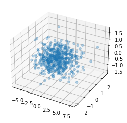
Once again, doesn’t tell us too much, but we can use it just to visualize the different scales that we’re looking at. The first principal component is on the x-axis and it scales from -5 to 7.5, the second one scales from -2 to 2, and the third one scaled from -1.5 to 1.5. This shows us the difference in variance explained by the components.
Image Compression with Python PCA via SKLearn
Alright, now that we’ve seen dimensionality reduction with PCA in action, let’s put it to something that we can more easily visualize and understand – image compression. Let’s keep in mind that in our dimensionality reduction example we kept 95% of our data variance.
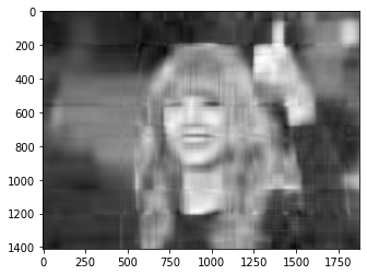
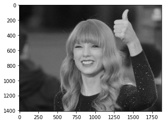
Now let’s take a look at how PCA works with Image Compression. We’ll import the imread library from matplotlib.pyplot to read our image data in. I’ve downloaded an image of my favorite celebrity, Taylor Swift, to do our image compression example with, but you can feel free to use whatever image you want.
In order to actually operate on the image, we’ll need to convert it into numerical format so we’ll cast it to the unsigned 8-bit integer type. I printed out the image shape and realized that it was a 3D image. That means it’s encoded in Red Green Blue with each of those colors being a 3rd axis. We need to convert it to a 2D image for PCA, so we’ll take the mean based on the last axis.
from matplotlib.pyplot import imread
img = imread("taylor-swift.jpg")
img = img.astype(np.uint8)
print(img.shape)
img = img.mean(axis=2)
plt.imshow(img, cmap="gray")
This is what the original image looks like (in grayscale):


Run PCA on the image to transform the image with the sklearn PCA transformation. Then, project it back onto itself to see what it looks like at the level of compression we set our PCA for. Next, create a function that takes a percentage and transforms our data to that percentage. Here’s a neat thing about the n_components parameter in PCA – if you pass it a whole number, it will create a PCA with that many dimensions, but if you pass it a number between 0 and 1 it will create a PCA projection that keeps that proportion of the variance!
SKLearn PCA Transform in Python for Image Compression
def transform(percentage):
    tswizzle_pca = PCA(n_components=percentage).fit(img)
    transformed = tswizzle_pca.transform(img)
    projected = tswizzle_pca.inverse_transform(transformed)
    plt.imshow(projected, cmap="gray")
Let’s take a look at what happens at 90, 95, 97, and 99 percent variances:
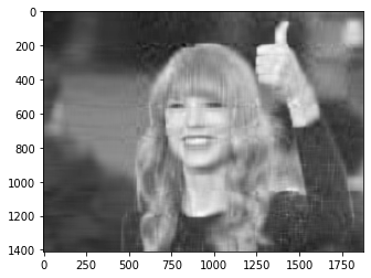
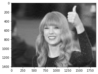
By 95% variance we can start seeing the picture. It’s kind of blurry still, but it’s pretty much there and we can make it out. At 99% we see the whole picture pretty much exactly as it was at 100%. Since this is about image compression let’s also take a look at the file sizes. The 90% one is 48KB, the 95% one is 52KB, the 97% one is 60KB, and the 99% one is 66KB. The size of the original image was 72KB. In conclusion, PCA is a great tool for dimensionality reduction and compression alike.
Further Reading
- The Best Way to do Named Entity Recognition (NER)
- How to Send an Email with Attachment in Python
- Prim’s Algorithm in Python
- Build Your Own AI Text Summarizer in Python
- Neural Network Code in Python from Scratch
I run this site to help you and others like you find cool projects and practice software skills. If this is helpful for you and you enjoy your ad free site, please help fund this site by donating below! If you can’t donate right now, please think of us next time.

